We did mention we were starting a colour series, and in between articles like choosing colours for your interiors, we’ll be sharing all the goodies we find in the colour world. Today, it’s the Dulux Colour Forecast 2016.
Part of our goal in this colour series is to encourage designers to step into our uncharted colour territories. At the beginning of the year, Pantone released their colours of the year, Rose Quartz and Serenity. It would be an understatement to say it didn’t break the internet, as everywhere I went I saw it. From set designs to styling by Interior Designers and Stylists, I got to see a lot of Rose quartz and Serenity, and they are really beautiful colours. Only thing is, I kind of felt they were safe colours, what I’d like to call easy colours. Its much easier to use subtle colours than strong colours. There is always that fear of perception and how people will relate to it. Not too long after, I stumbled upon the Dulux colour forecast for 2016 by Dulux Australia which was released last year, and what I saw was a completely different direction from Pantone’s and even the previous Dulux colour forecast. It made a really strong impression; the choice of colours and how they were combined was really refreshing, stunning and bold. Have a look,
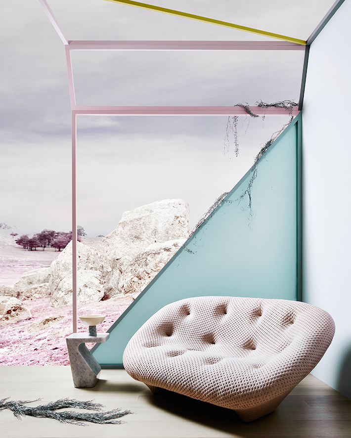
BIO FRAGILITY…
A more subtle vibe from the rest of the colour forecast, its inspiration comes from natural and living matter of a chalky brittle nature. The colours here are easier to choose and remind me of pastels. They are beautiful and look ethereal as the name, Bio-Fragility suggests.
RETROMIX….
Retromix might be my favourite of the palettes (but, after I thinking I’d made that decision, I see the rest, and I’m confused again). The colours here are not your usual colours, except maybe when you pick one and pair with another (usually a light one). The strength of this palette is in it’s diversity and boldness. Its like a work of art. Here is how they describe it,
“Retro remix celebrates the lighter aspects of the new retro movement where experimentation in colour combinations leads to acid brights clashing with faded muddied colours such as browns and olive greens.”

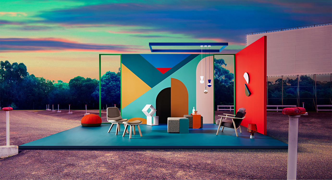
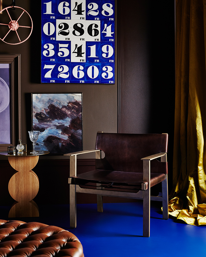
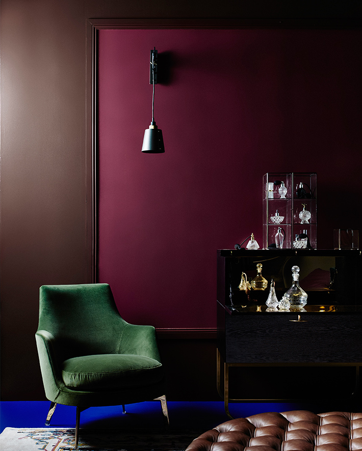
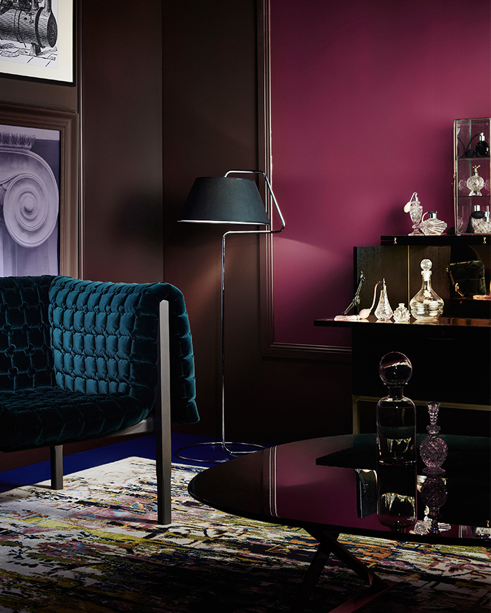
FUTUREPAST….
The inspiration behind the colours in this collection draws from the “steam punk” era of the 19th century. What they did here was to take the old dark traditional colours associated with that time and pair them with softer modern colours like mustard, pink and purple. The aim is to create “a new version of the old” and I think they nailed it. While in the Nigerian context and other parts of Africa, we may not exactly relate to the steam punk era, it’s old dark traditional colours do relate somewhat to the colonial and post colonial era here. With that understanding, this is certainly an updated version of the old and it feels like a classic.
“Future Past takes its cues from steampunk merging with modern design – creating a new version of the old. Deep and decadent traditional hues are made modern with the addition of mustard, pink and purple.” – Dulux Australia
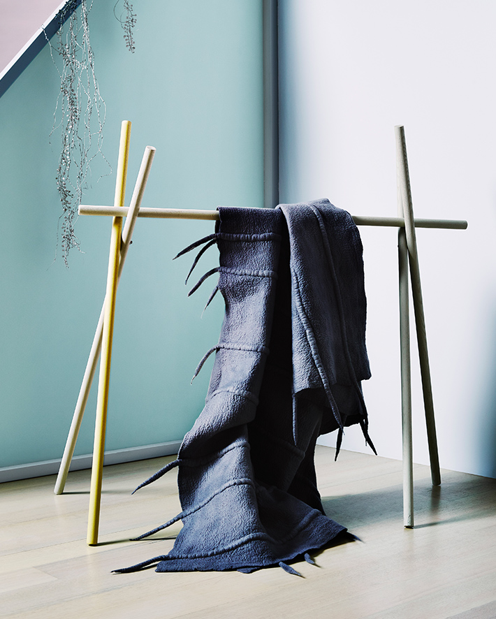
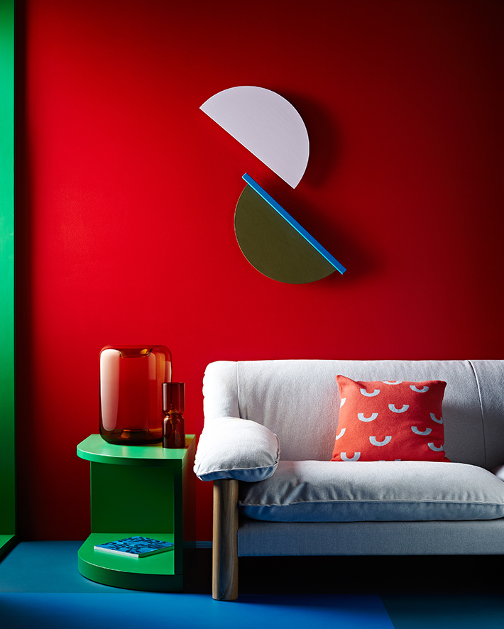
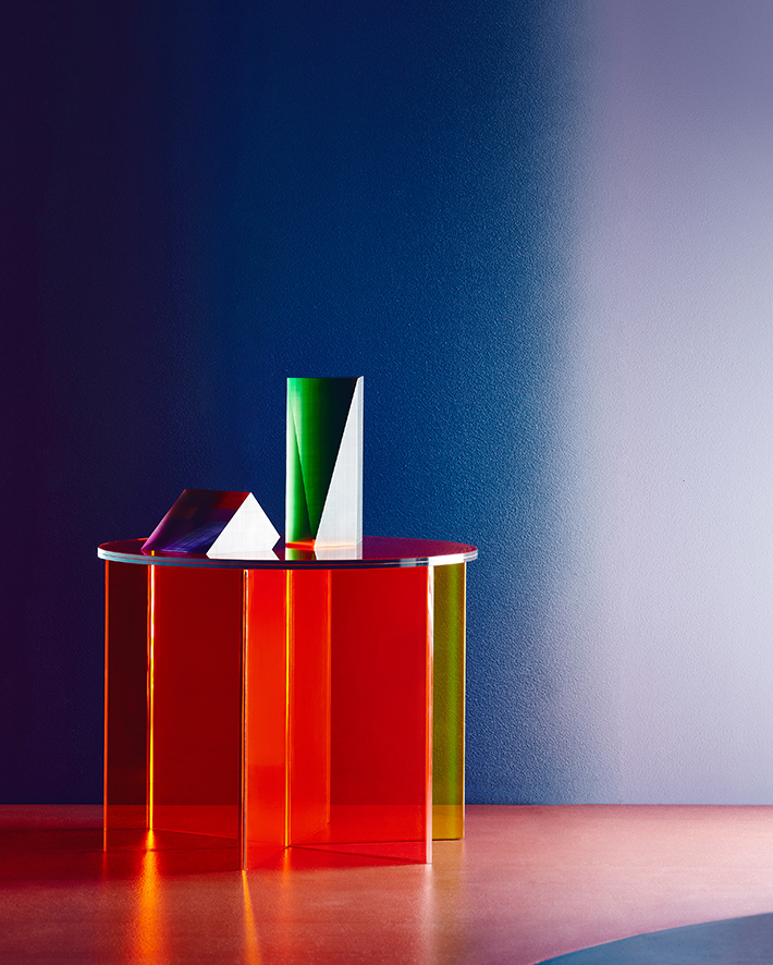
INFINITE WORLDS…
Influenced by the uncharted world of deep space, with its characteristic deep tones, contrasted by bright hues and other elements, the palette comprises of predominantly dark colours mixed with “flashes of brilliant reds, pinks and coral and space age metallics” for contrast. If pictures were words, this color palette would be “rich”. Dark colours are not something that are used regularly, but when they are, they are often so cosy and look invested.

To know more about the Dulux colour forecast 2016, and see the rest of the set design and videos of the collaborative process, check here. Please leave a review, lets know how the Dulux colour forecast makes you feel.