It’s a new month and we have a couple of new things lined up, one of which is a colour series. Sometimes, picking a colour for our interiors can be a really confusing, difficult and time-consuming process.
Confusing, because you are spoilt for choice; difficult, because you have to let go of other beautiful colours and don’t understand why you have to; and time-consuming, because, going through a confusing and difficult process takes some time before you finally arrive at your answer. Most professional designers do not have this issue, because overtime, they have developed their own formulas for choosing colours; and when they have a project, depending on the scenario, they have a process they follow. A good understanding of why you are picking a colour is very important, as it makes letting go of other colours easier. So if you are a design enthusiast with a colour project, or a designer that is presently in that “confusing colour selection process”, this is for you. In the first part of this series, we will be taking you through important considerations to make when choosing colour(s). Please note that this is not the “end-all-be-all” of colour selection, but it will certainly put you in the right path. Have a look.

1.
Start with a favourite colour.
Its always good to start with a favourite colour considering the fact that it’s a colour you love, because at the end of the day you will want to come into your space and see something you love and not the other way around.
If you have more than one favourite colour, make a list of them for subsequent selection. Incase you don’t know what your favourite colour is, looking at the colours of your favourite items will give a clue as to what it is. You can pick a colour or more to start with.
2.
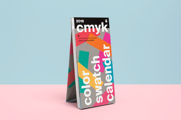
Work with a colour swatch.
Using a colour swatch gives you a comprehensive view of colours and their variations. You will get to see your favourite colours and other colours that may interest you and make selections for your space. If you don’t have a colour swatch, you can go online and use the ones the paint brands have as a guide.
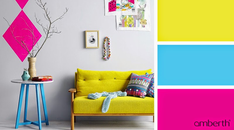
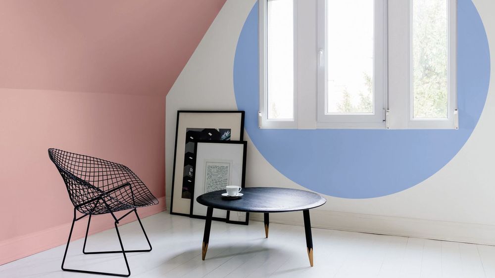
3. Consider mood and feeling.
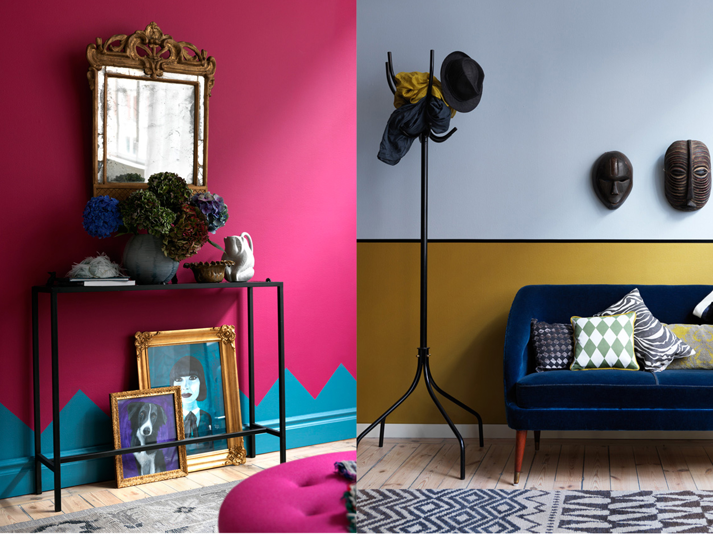
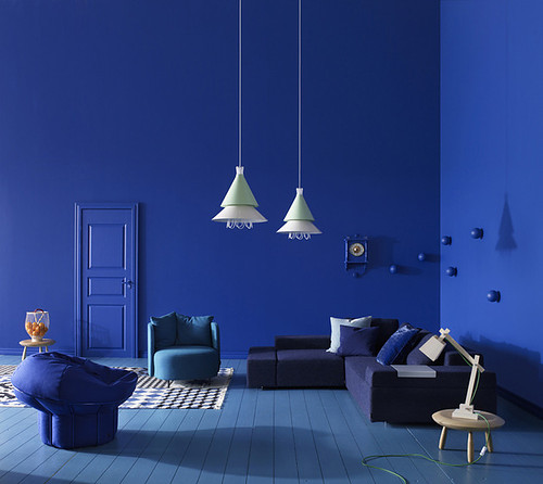
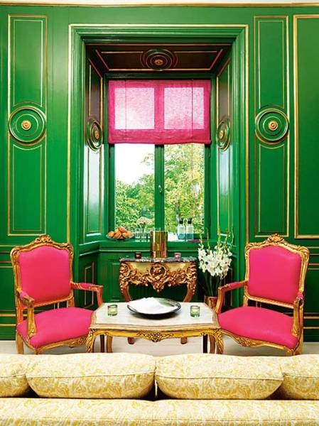
The best thing about interior design is the mood and feeling it creates. Have you ever entered a space and it gives you a certain vibe, and you enter another and it gives you something completely different. All the different features and elements in the space come together to give a certain feeling, and colour plays a major role in that. The question at this point is, how do you want to feel when you are in the space? or What type of feeling do you want to create in this space? Once you have the answer, you can create a selection of colours that would create such a feeling. If feeling is more of a requirement than colour favouritism- like when designing for public spaces- you can use the list you created here to knock off colours from your favourite list that would create a contrary feeling. The three images show different interiors that create different moods and feelings. Image at the top is from Apartment Therapy and the image on the right is courtesy of Visualize Us.
4. Consider lighting.
Too bad some architects don’t design appropriately for daylight. Let’s face it, you enter some spaces and they are not properly lit. Even during the day, the space is dark and gloomy. Despite the architects fail in this regard, your choice of colour can lighten up the space and expel that gloomy look. Technically, the use of white in an interior is known to not only make a room feel bigger, but also make it look brighter. Also, other colours in the category of off-white and nudes as well as bright colours like pink, yellow, powder blue etc will also do similar. In the event your space falls into this category you can select the “light-bringing” colours that you feel will look good for your project and work well with your previous colour selections. If brightness is not a prerequisite here, you can use the low-lit nature of the space to create a cozy, intimate and rich coloured interior by choosing one or more deep dark saturated colour(s). Also note that bright saturated colours like pink etc, tend to go well with dark saturated colours.

A well lit interior with white walls and powder blue accent wall. Image is courtesy of Homify.

Interior painted with dark saturated blue with maroon accent chair ~ really cozy, intimate and rich! Image is courtesy of Decor8 Blog
5. Consider aesthetics.
At the ending of the day, you want your space to not just create the right mood, but you also want it to be appealing to the eyes. Create a selection of colours that you feel are pretty to look at, and compare with the previous list you have created from subsequent considerations.

6.
Consider your canvas.
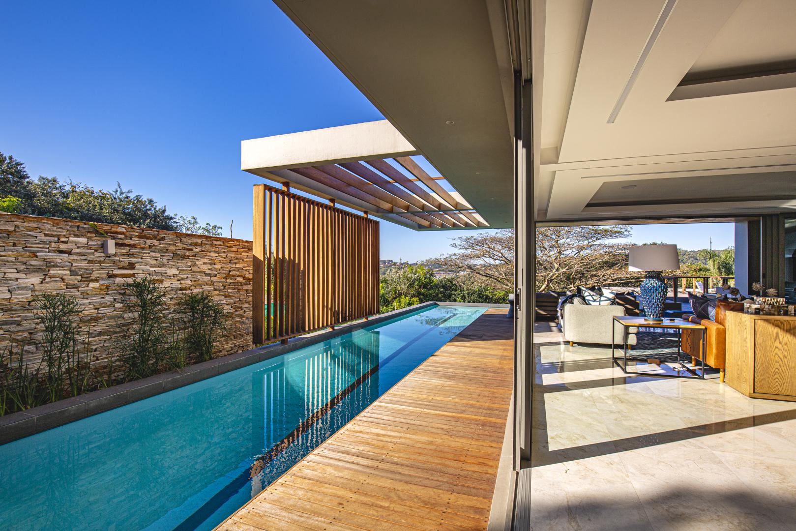
This helps you determine how many colours you will be needing. Your canvas is the surface you will be painting, which usually is your walls and your ceilings. Take into consideration the design of the surfaces, whether they have 3dimensional features or any particular design feature that you may want to highlight with an accent colour.
Take panel walls for example, you may want to paint the trimmings of a wood panel a seperate colour from the panel itself, so that’s two colours. Or, you may want to paint each inner panel with an individual colour (a really colourful effect), that’s multiple colours. You may also just want to paint it all one colour, like the image below. Knowing the number of surfaces you will be painting will help you decide the number of colours you will need. At this point, you can decide if you want to paint the wall one colour, or if you want to combine colours and where you want each to be.

7. Consider the users and the use of the space.
When you are choosing colours, it’s very important to consider the use and the users of the space whether it’s a private or public space, a project or your personal space at home. For example, if you have a partner with whom you share your home if you will be sharing it with your partner, you will need to consider their preferences. Its all about meeting in the middle, 😀 . It shouldn’t be too masculine for a woman or too soft for a man, except of course, they like it that way. Considering this, certain colours that weren’t in your previous selection will most likely find their way in there. Also, colours that have previously been selected may find their way out because they weren’t suitable for the users or the use of the space.
So now you probably have more colours than you can use to paint your space. For what to do with them, find out in Part 2 of the Colour Series.
P.S. In case you have a guide for, or more about “choosing colours” which is not listed here, you can drop a comment below. If we get a handful, we can sum them all up in a post, acknowledging you 🙂 .